Teahaus: Mobile Brand Engagement
Spring 2014
The first project in my Interactive III class was to create a cross-platform mobile presence for a pre-existing brand that had little to no mobile presence. I chose Teahaus, a tea shop based out of Ann Arbor, MI. As of 2014, they had a website but no mobile app. They concentrate on providing their customers with knowledge about teas as well as the teas themselves, so I wanted to focus on that aspect of their brand.
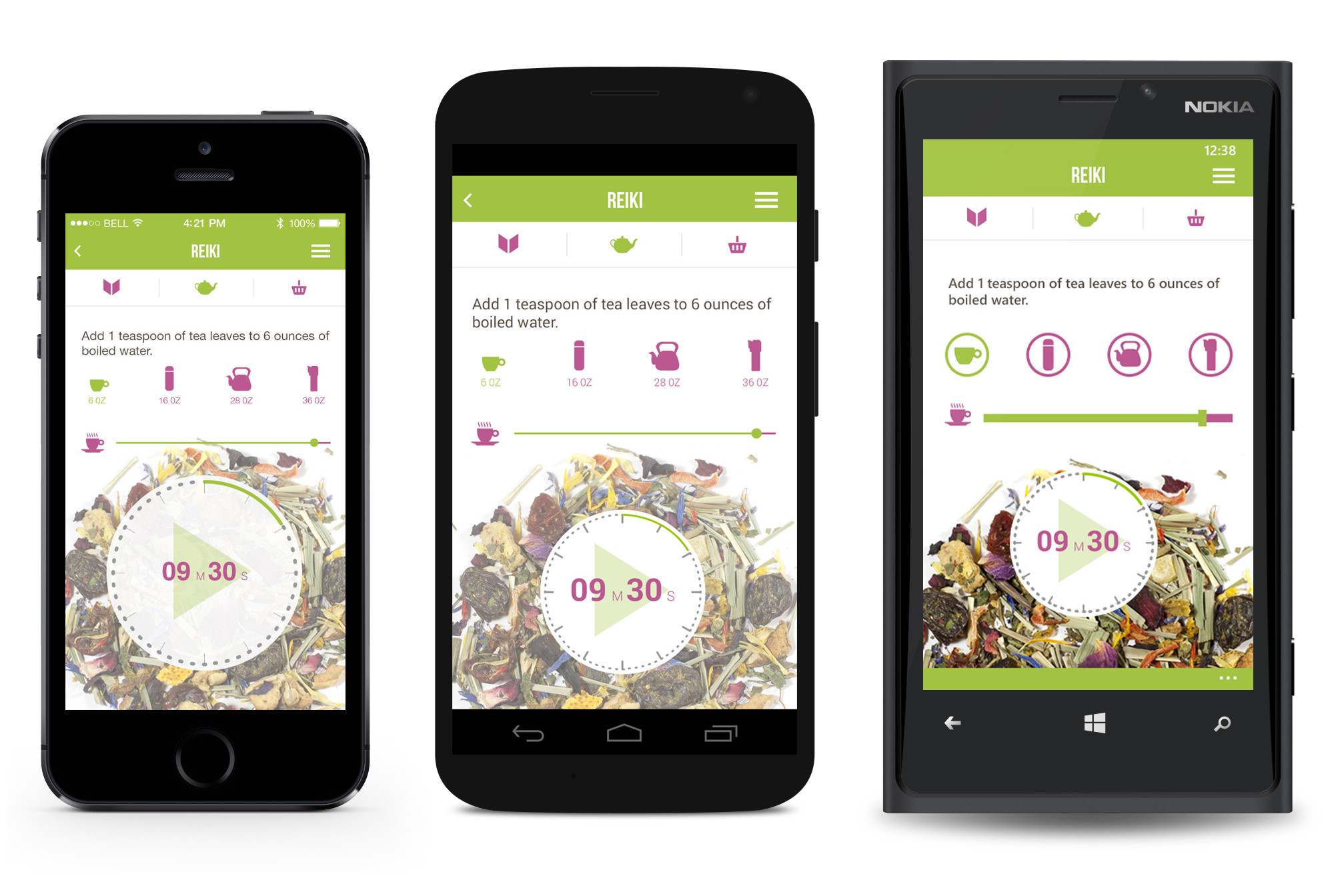
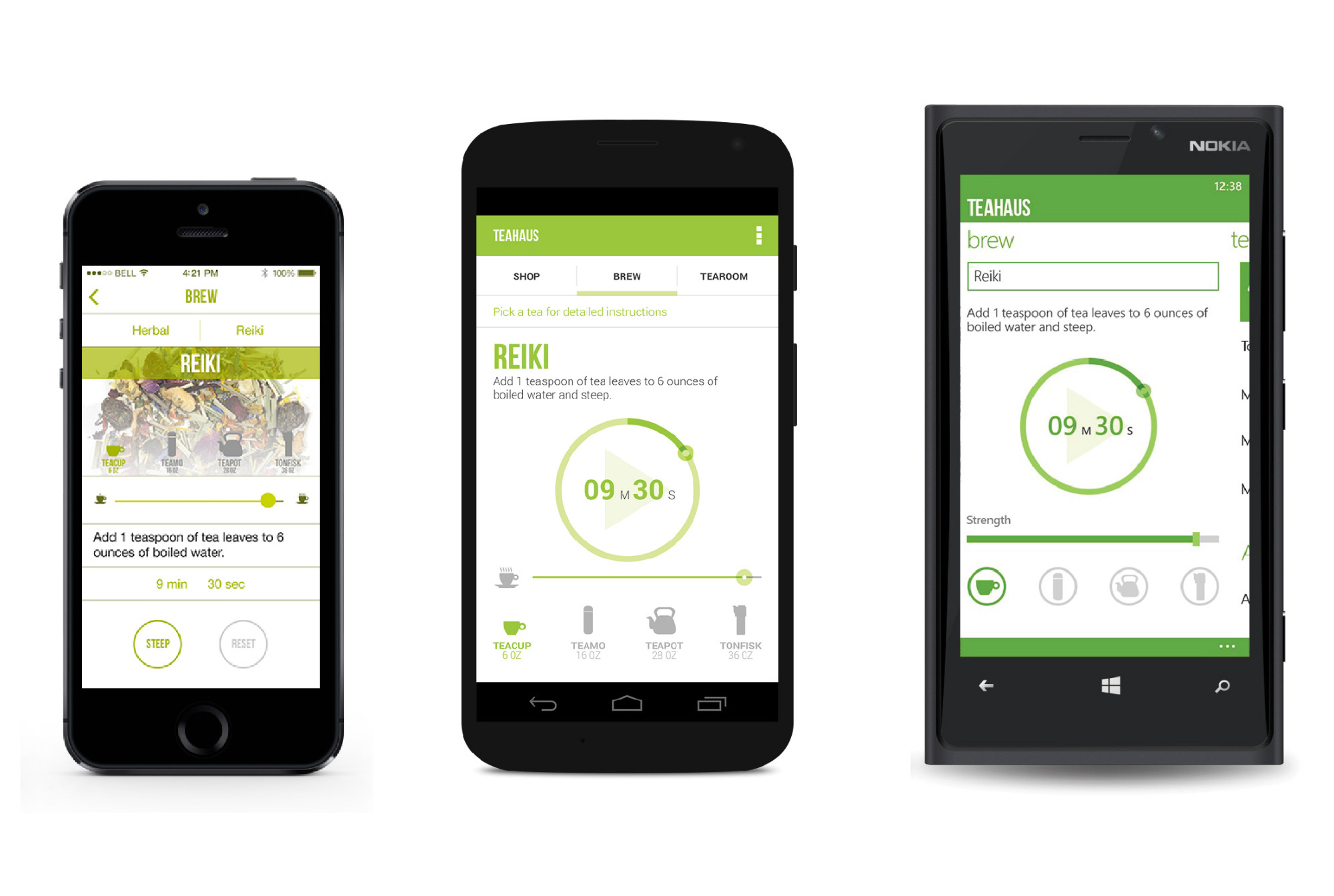
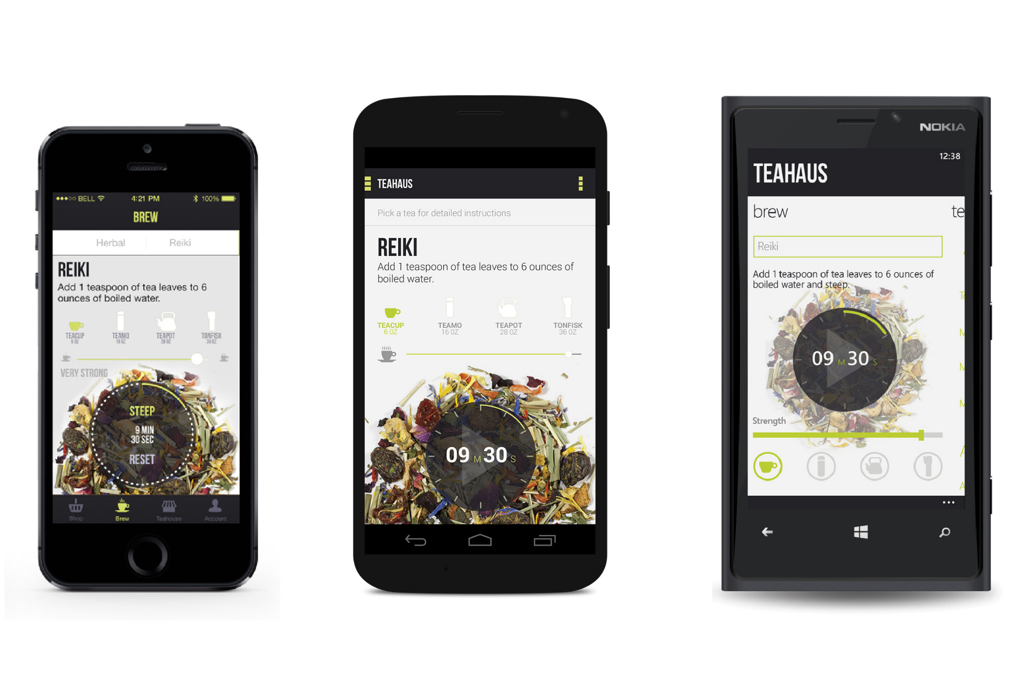
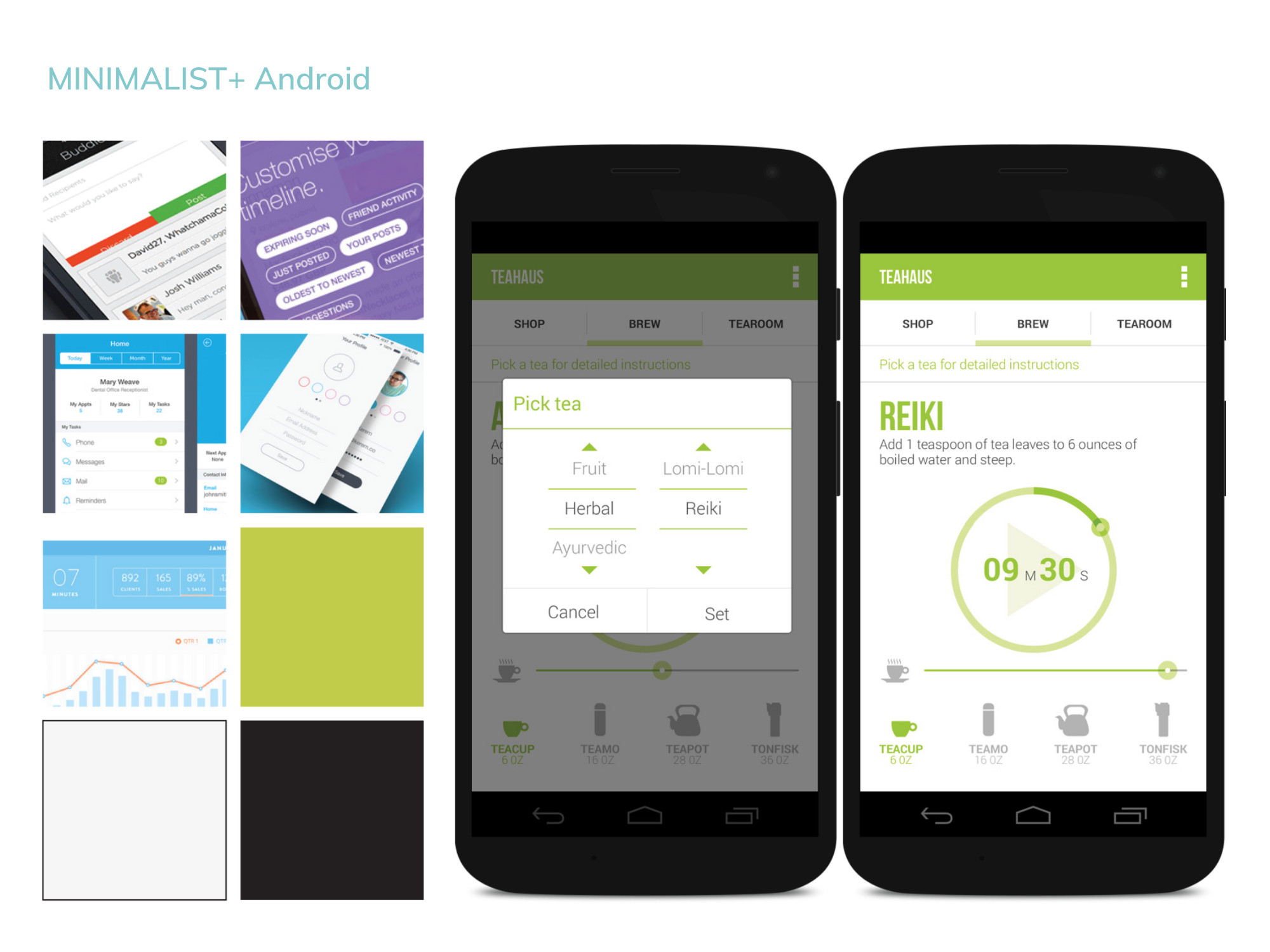
After exploring different navigation and design directions, I finally created a universal design that remains fairly consistent across the three platforms.
View Process DocumentationResearch
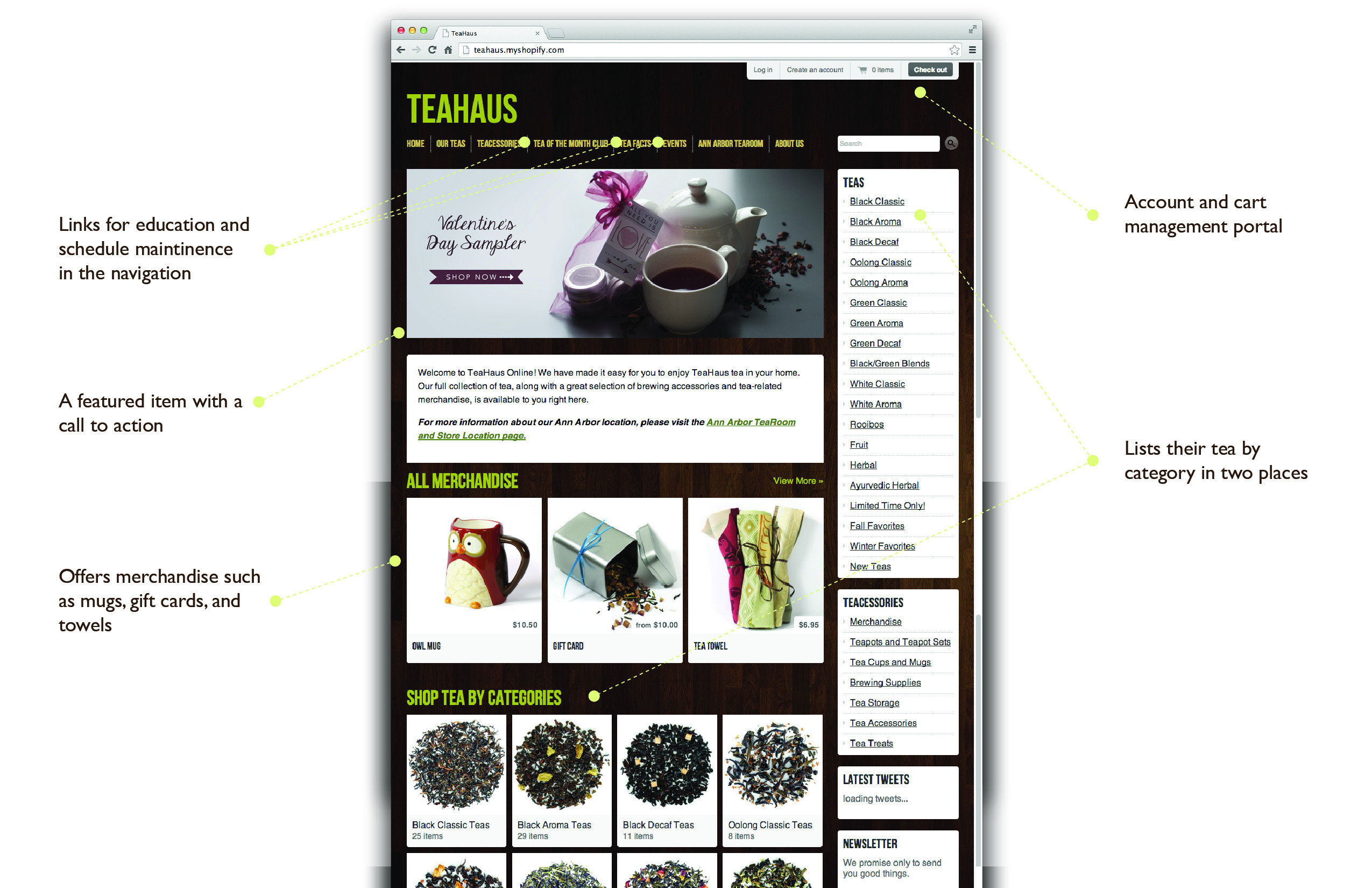
My target user is a tea drinker in their twenties through fifties who enjoys learning about tea as well as drinking it. Teahaus provides experience and education as well as the highest quality tea available on the market. They also have a monthly tea club, and maintains a digital calendar of events at the tea house.
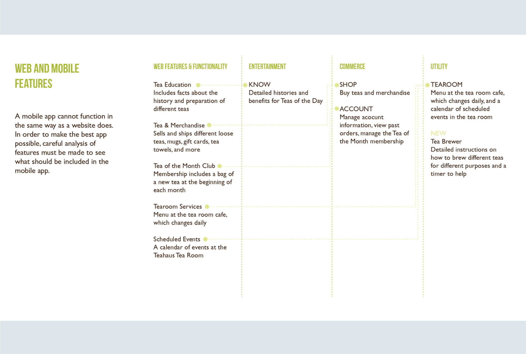
I analyzed all the features of the Teahaus website, putting them in different categories to decide how to structure the mobile experience. In order to give the mobile app a unique experience that would keep users engaged, I added a Brew feature.
User Experience
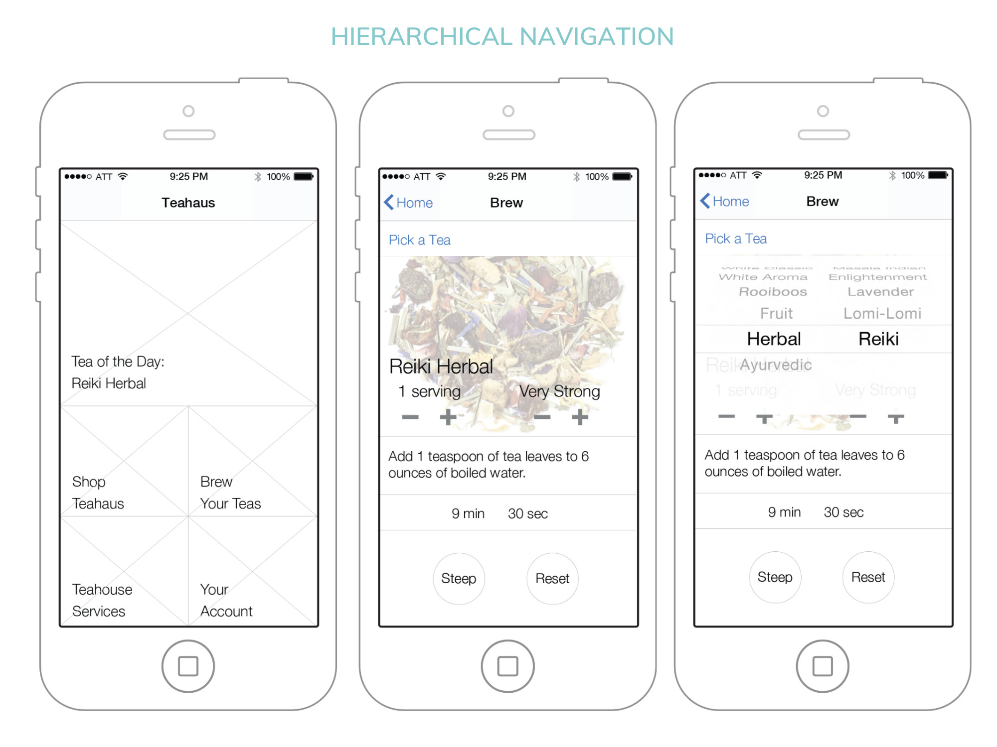
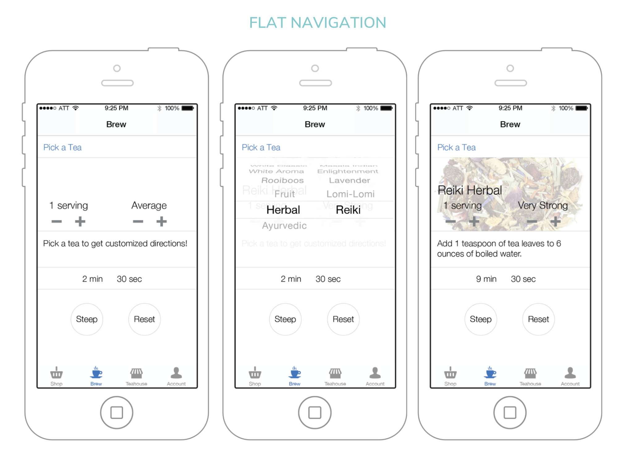
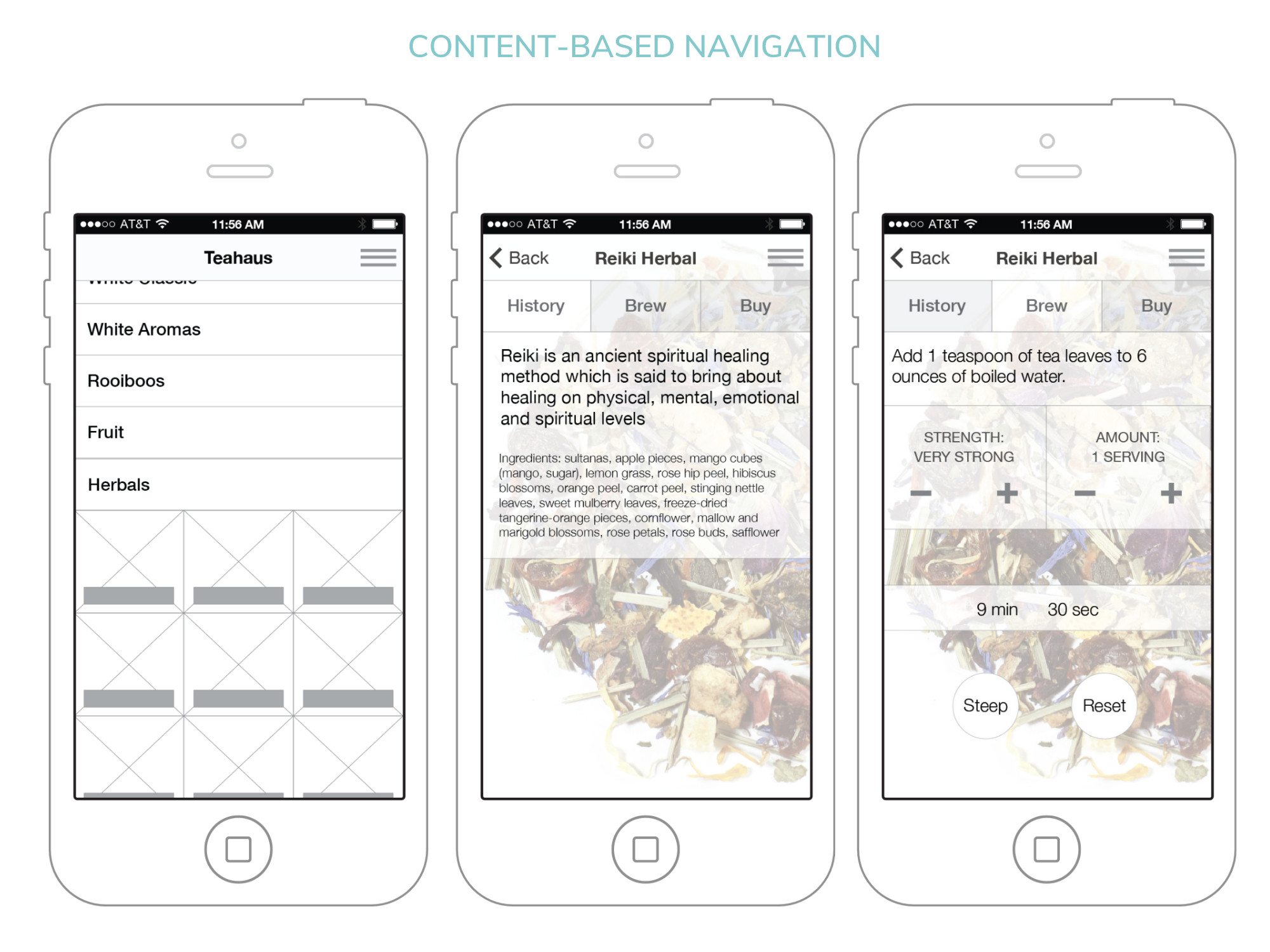
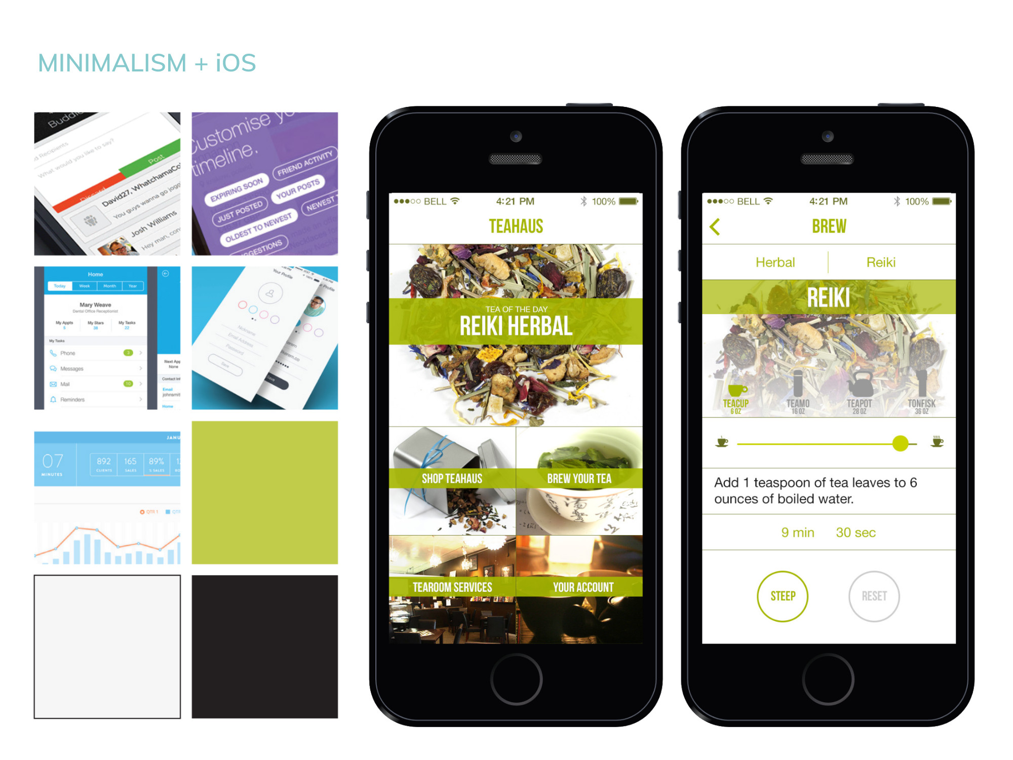
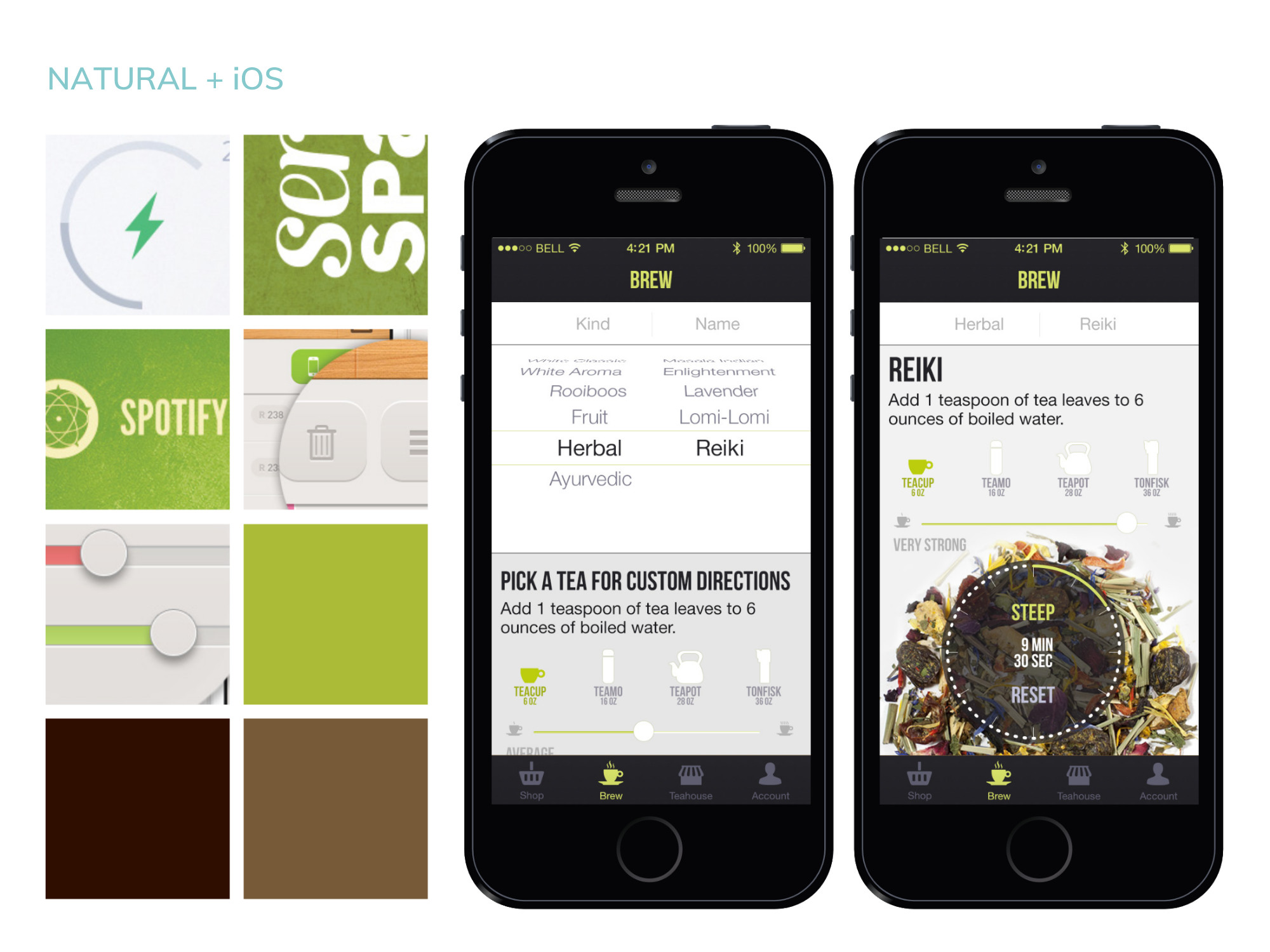
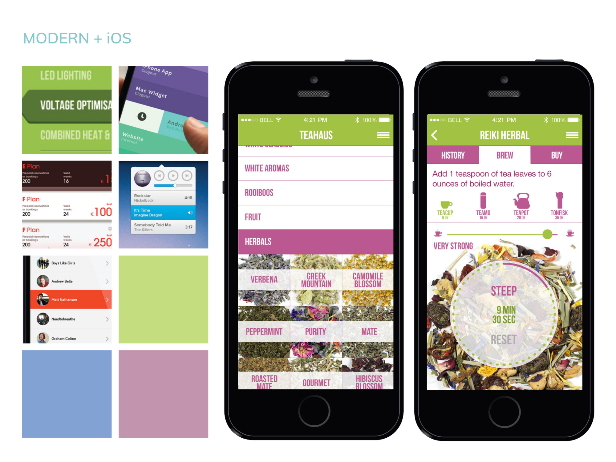
The challenge of this assignment was exploring different kinds of navigation across the iOS, Android, and Windows platforms, since each platform has different standards that change how navigation can be implemented. I explored three methods in wireframes: a hierarchical navigation, with a central home screen that lets users dive deeper into features of the app; a flat navigation, where the main features of the app are always available in an always-present menu bar; and a content-driven navigation that focuses on the teas, with other features concealed in a hidden menu.
Visual Design
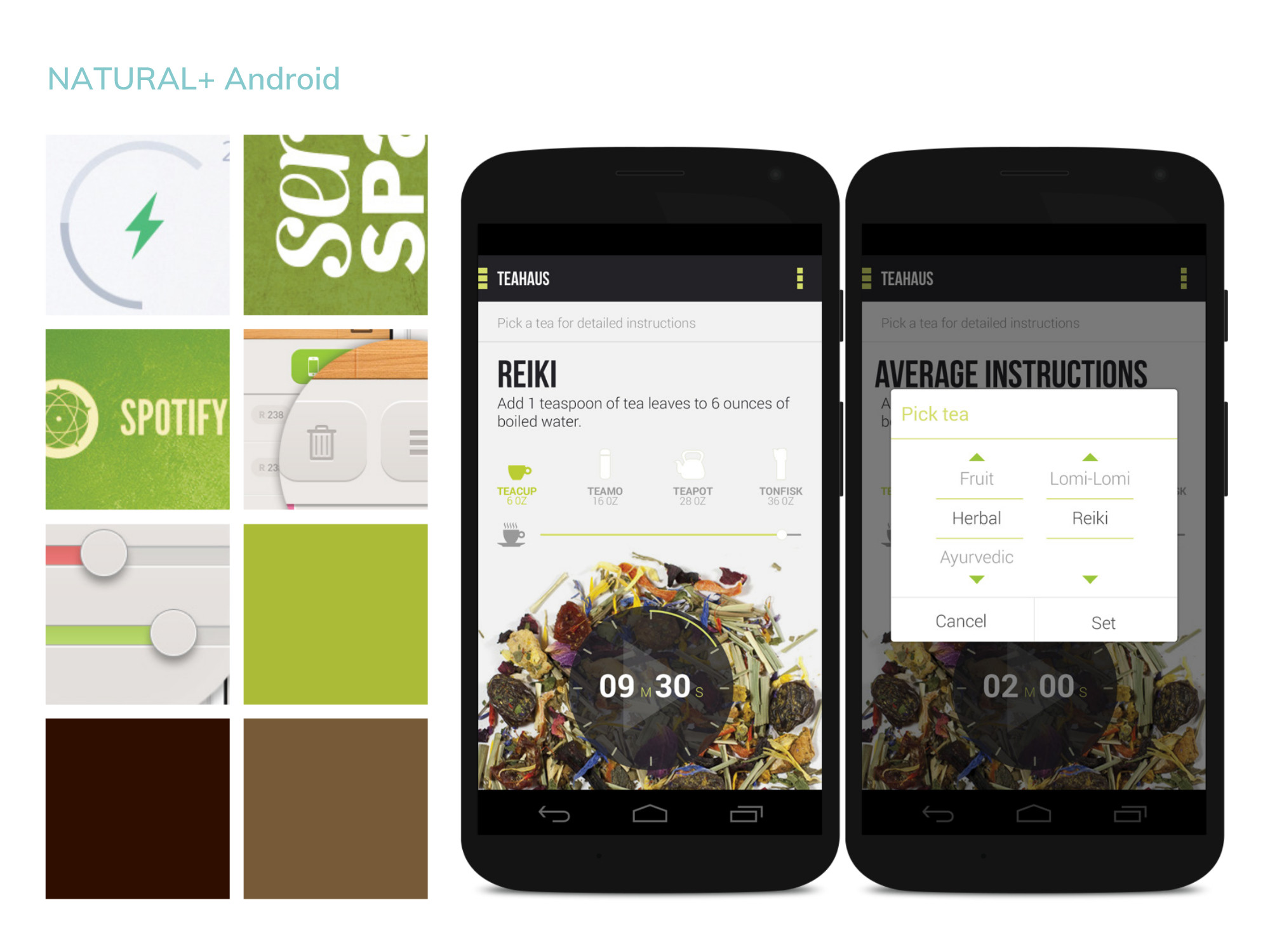
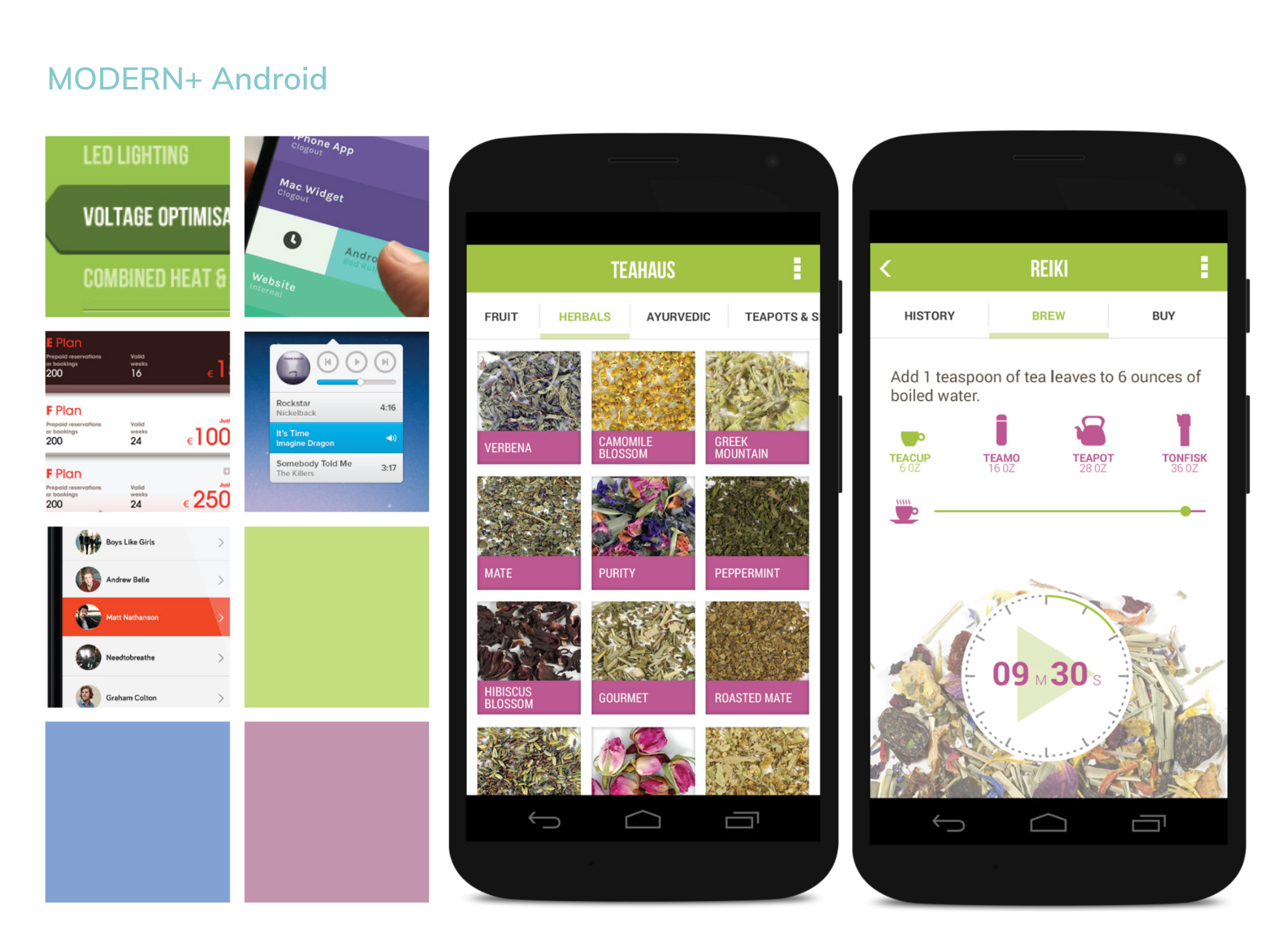
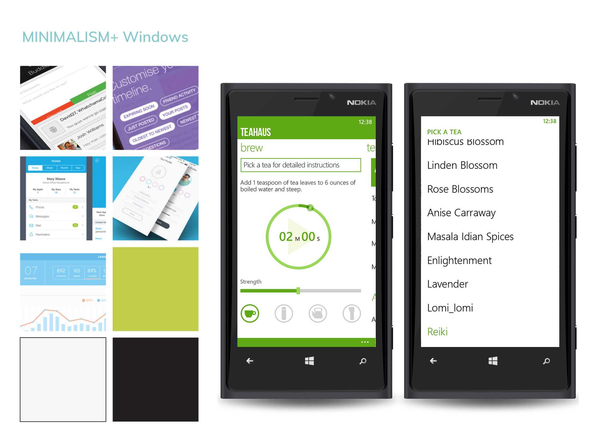
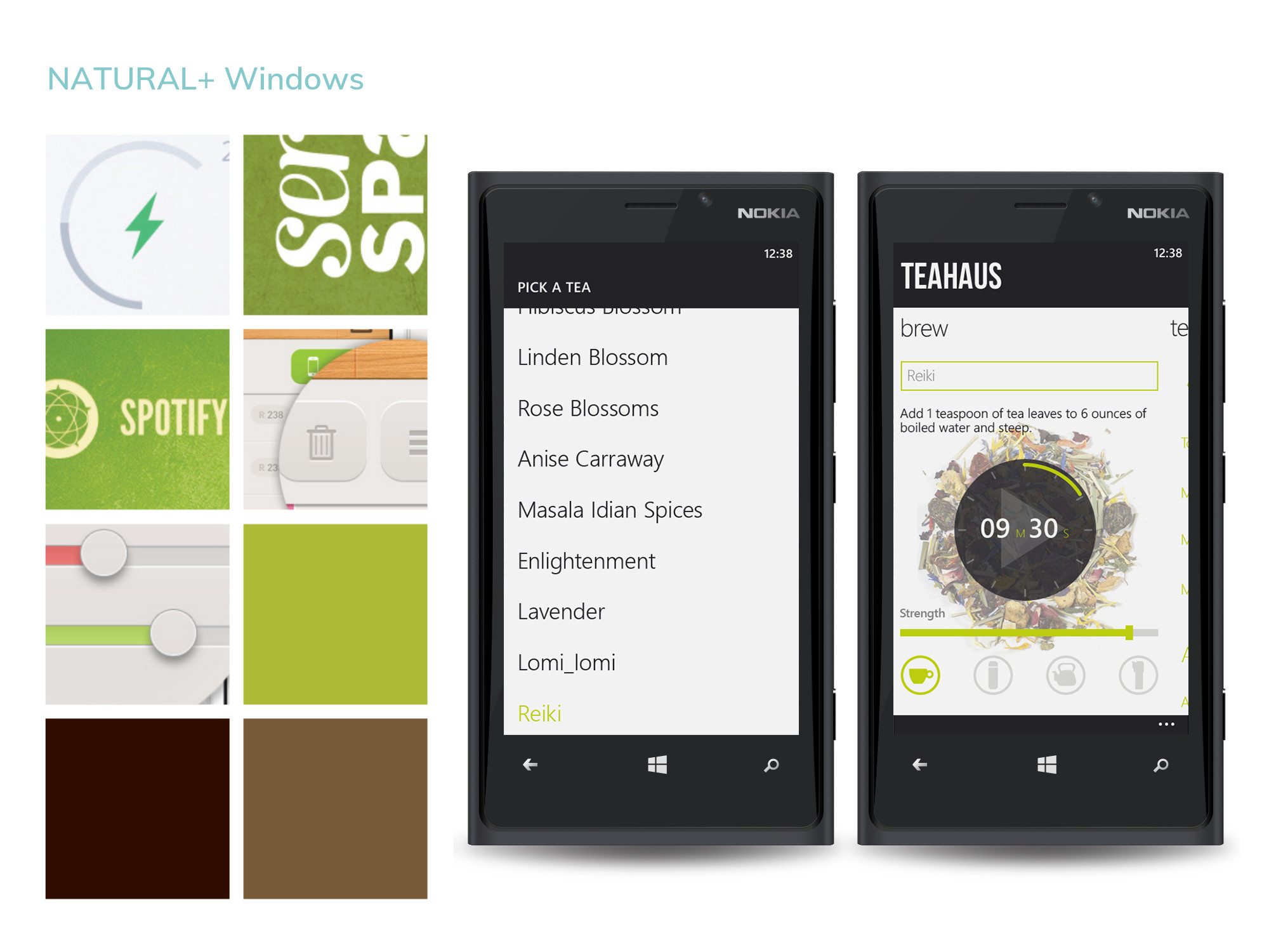
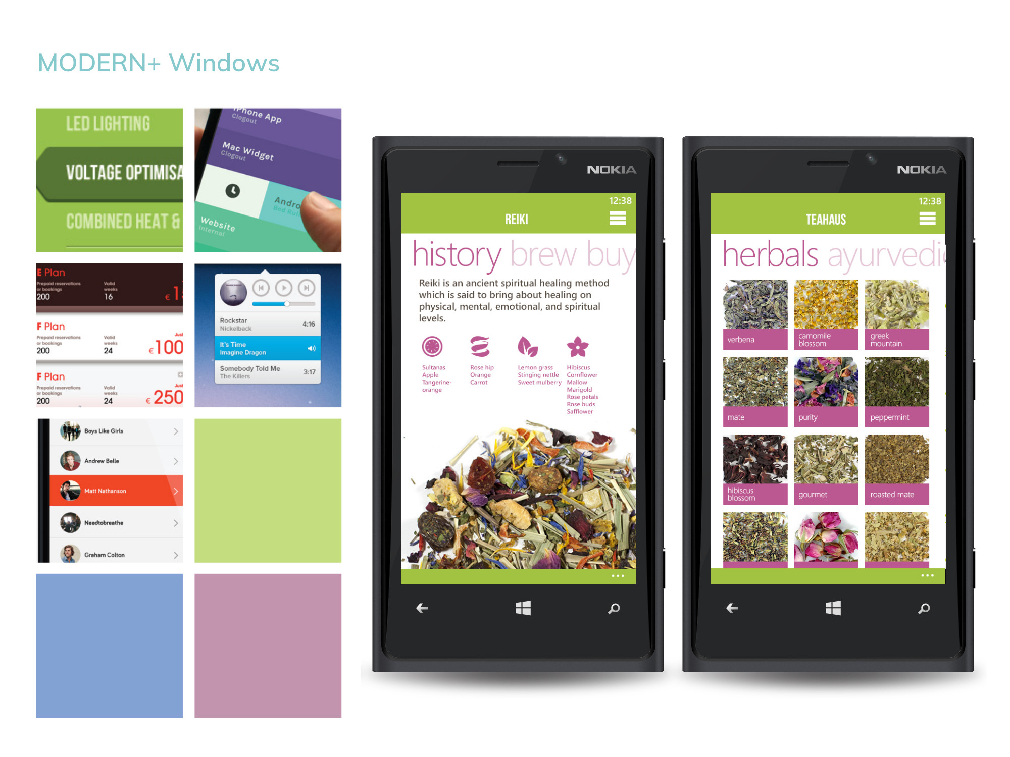
Each style of navigation was given a different visual aesthetic, modified across platforms. The Minimalist design direction was characterized by a focus on photography against a white background, highlighted by Teahaus green. The Natural direction was characterized by slight textures and darker colors. Finally, the Modern design introducted a contrasting pink to highlight interactive elements as well as Teahaus green.
Who's Keiran?
Keiran Pillman is a designer, illustrator, and researcher living in Rochester, NY. They have a BFA in New Media Design from the Rochester Institute of Technology (2015), and a MFA in Art History from the University of Massachusetts Amherst (2017). They have worked as a freelance designer and illustrator for seven years, doing projects for a variety of clients.
In their spare time, Keiran enjoys running, hiking, writing both fiction and non-fiction, and serving as a loyal minion for their cat.
